View this PageEdit this PageAttachments to this PageHistory of this PageHomeRecent ChangesSearch the SwikiHelp Guide

The JESDB Page

JESDB is a debugger for the JES environment. It is currently under development. The main difference between JESDB and other debuggers is that the user can monitor the program without it having to stop. This requirement is due to the nature of the homework assignments in CS1315. Thousands of pixels and thousands of some samples need to be processed, and it would be too tedious for the programmer to tell the debugger to continue after a breakpoint has been hit, when the breakpoint could be passed thousands of times at each execution.


SECTION I. Brain Storming


Slider/Scrollbar


Question from the peanut gallery


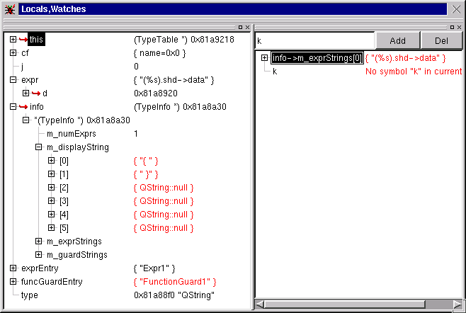
How to display data

There are 2 ways to represent the time axis(That I am currently liking):

Other Issues

Advanced Ideas

References


Mark Comments:

I don't know if email is more likely to get conversation with this group or CoWeb posting, so I'll write this here, then copy-paste it onto the page.


Mark

More comments?


On Thu, 12 Jun 2003, Mark Guzdial wrote:
> - If we're going to have Step, then I think that Step should be a
setting
> at the bottom of the slider. If the slider is set to Step, then only the
> Step button moves it forward.

That sounds good. That is same as having the slider at the 'stop'
position.

> - I like the first time-on-y-axis view the most, but the variable
display
> and time sequence has to be made clearer. Why isn't the list shown? Why
> doesn't "n" have a value on the line when it's set to the list size?

We had a discussion about this in the meeting. Should the column
values be before or after the execution of the instruction? In
retrospect, 'after' is probably better, but we did not have a
definite answer yet.

> - I'm very much against breakpoints – I think it's too hard to grok. How
> about we do this: User specifies VARIABLES that they want to watch,
we
> pre-compute the lines where the variable is used or set, then we
insert
> breakpoints (invisibly) for the student and show those variables on
those
> lines?

This is a good idea. It'll definitely be more understandable and less
tedious. But would it confuse some student why the lines are picked as
breakpoints? I am not sure now whether showing every line is better or
only show some of them. Because if we only show some lines, students
would be confused at the discontinuity, especially if we chose the lines.


So right now the image in my head is a hybrid of the 2 ideas (both
time on vertical-axis and time on time-axis). we have the current
line cursor moving around in the editor window. And now the watcher
is going to be a table in a separate window. It is going to look like
the time-on-vertical-axis picture. It will show about 10 rows and it
permits scrollback up to say hundreds of instructions. Is this a good
design?


-Yu Cheung "toby" Ho (airport@cc.gatech.edu)


SECTION II: First prototype and feedback

The first prototype of the graphical debugger is out (6/18/03). I demoed it at the meeting and recieved some useful feedbacks.

Screenshots

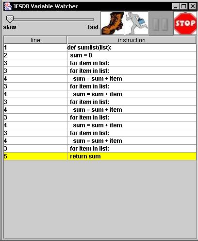
Uploaded Image: debugger ss.jpg

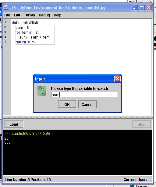
Uploaded Image: getvar.jpg

Feedback

Other Todos


SECTION III: 2nd Prototype

The second prototype is out on 2/25/03.

Screenshots

Uploaded Image: screen.jpg

Feedback

Other Todos

Looks very nice, but how does it look with variables, too? Mark Guzdial

SECTION IV: Version III

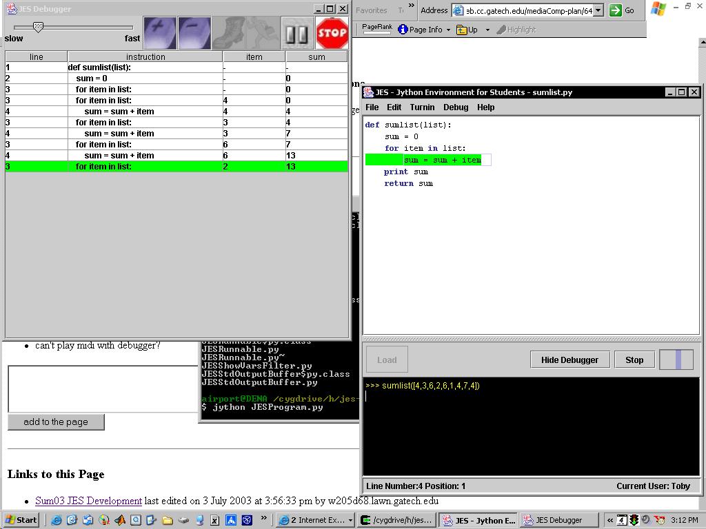
Out July 2nd, 2003.

Screenshots

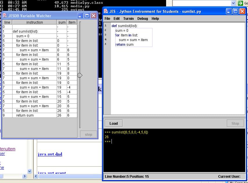
Uploaded Image: screenshot.jpg

Bugs

mad bugs right now

Other Todos


Links to this Page